Whatever are your needs, I can do it, making the user experience more pleasant. Clear, concise, and useful. Those are the rules, in English and Spanish :)
Copywriting
Your product needs to make big sales and that's where your copywriter comes in handy. Any product, ANY, can be described. Through different techniques, voice and tones merge together making your advertising right to aim.
Content Writing and Storytelling
Every story needs to be told, and without the right tools, it can become a nightmare. I can captivate with words (and also with some magic dust!)
Portfolio
For my current work at Awkbit, please check out this link! Writing at Awkbit
OOVI
Landing Page through AIDA formula
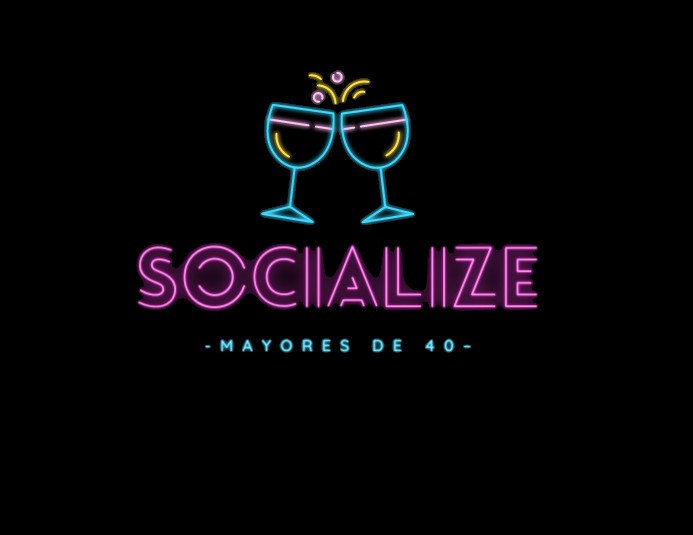
Socialize App
UX Writing
SuperStray App
UX Writing | Copywriting | Content Design
Fireplace & Co.
Copywriting | UX Writing | Email
Bad Weather Challenge
UX Writing
Ad for an App - Challenge
UX Writing - Copywriting
Socialize App
App to meet people through different activities.
I was lucky enough to learn UX Writing with one great teacher, Mr.
Mario Ferrer, who did wonderful things for King (Bubble Witch and Candy Crush). For the final project of the course, we had to develop
an app. He did one about tacos delivery, and I prefered to go for a social app, that would make the process of making friends, getting to know people better, or maybe a date, a little bit easier.
Socialize is a fictitious app for people older than 40 years old. It's an option for other apps like Tinder or Happn. The main difference is that it only focuses on sharing activities that are social gatherings, sports,
or cultural meetings. Examples: museum visits, some fun at a bowling alley, or some nice dinner setup.
The tone is casual and friendly, adding some emojis once in a while to show humanity. With concise language, it guides the user through the app for the first time. The focus is also kept on the user. Talk
to them, not at them.
I added some screens like a chatbot, errors, alert and push notifications.
Research: I did research on my own, paying attention to some complaints about the apps being all the same. Also, some people expressed nervousness when they have to meet other people on one in one date.
They wanted different experiences, where they could feel more at ease with more people.
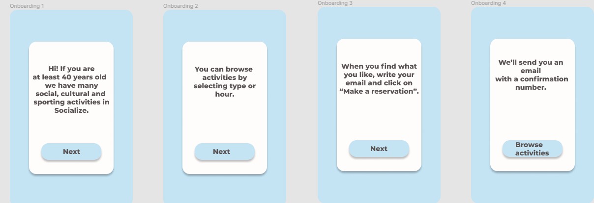
Onboarding
Onboarding
The onboarding is simple, clear, and concise. It states what the app is, how it works and how to make a reservation.
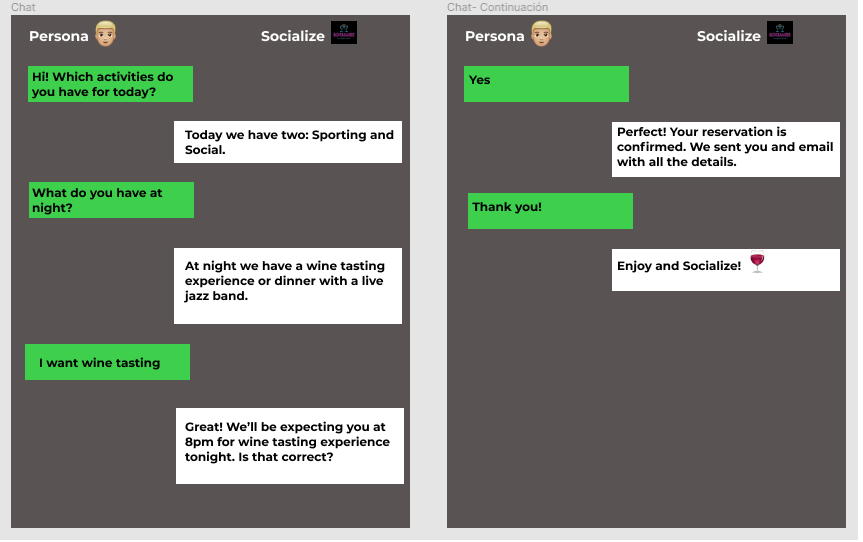
Chatbot
Chatbot
The conversation is clear, repeating patterns for confirmation purposes (like restating the time or the kind of activities)
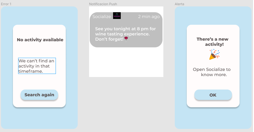
Error, Alert and Push Notifications
Error, Alert and Push Notifications
Error, alert and push notifications: For error handling, the app invites the user to find another activity if there is none available for that time frame. The push notification is friendly, reminding
you about the event you are attending, with a emoji that represents the activity. The alert screen, opens up a informing the user and inviting them to check the app to check a new available activity.
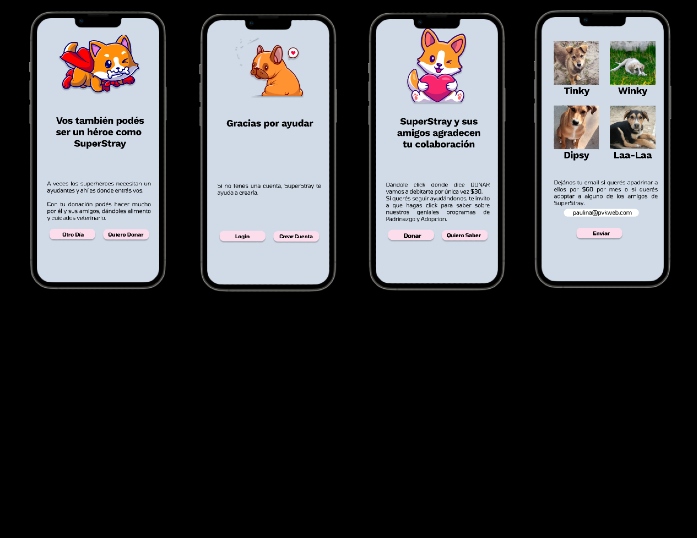
SuperStray App
App to donate, sponsor or adopt a dog.
For Spanish explanation and chartflow, go down
My first project using Figma. Like I said before, I'm not a graphic designer, so please, focus on the text. Even though it was in Spanish, I can translate it for you. On the first screen, you are introduced to our main
character, SuperStray. He invites you to be his sidekick, collaborating with him through donations. Please keep in mind that some writing can be lost in translation.
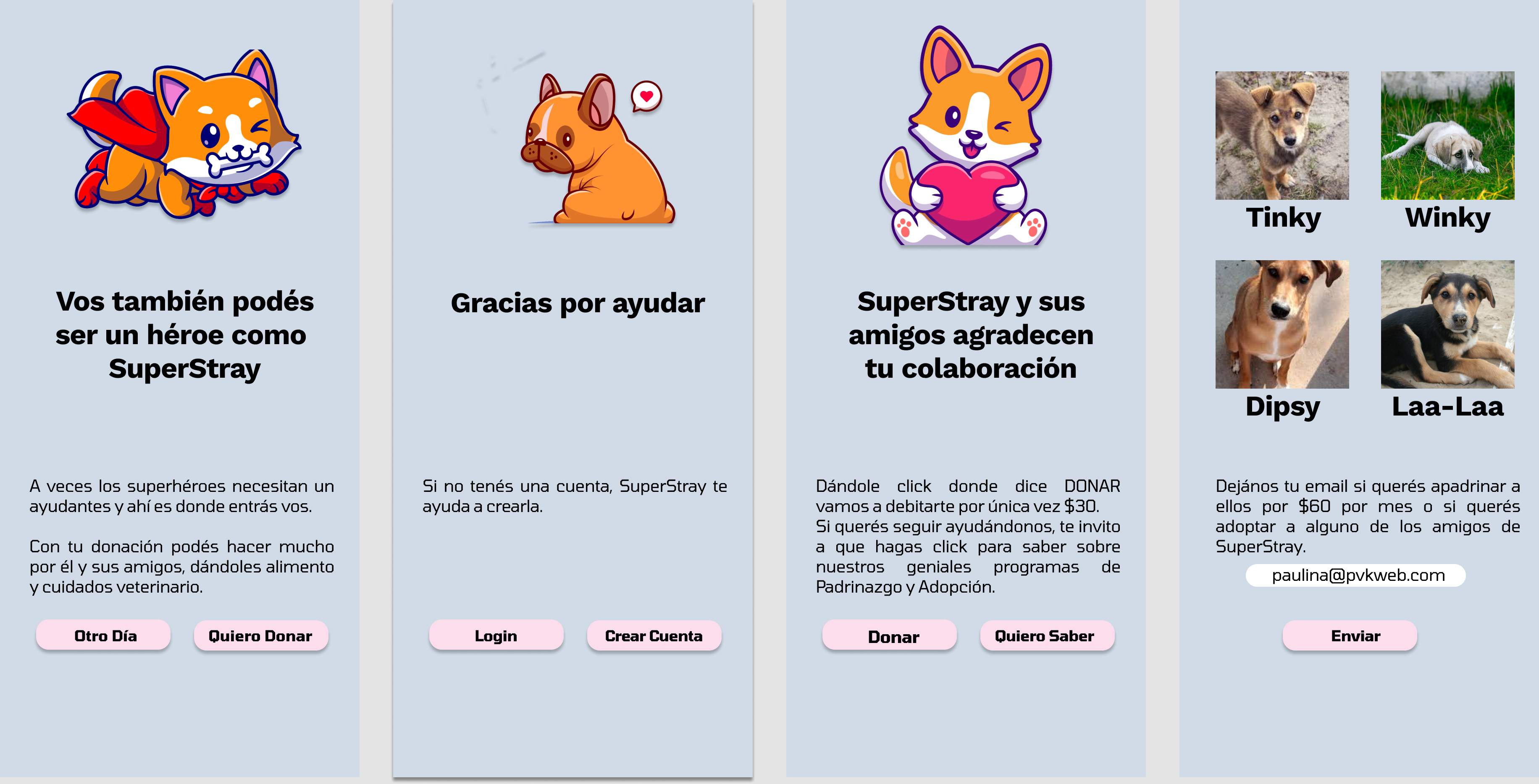
First Screen: Header: "You too can be a hero like SuperStray. " Text: "Sometimes superheroes need helpers and that 's where you step in. With your donation, you can do a lot for him and his friends,
providing food and vet care." CTA: Button saying: Another Day Button saying: I want to donate
Second Screen: Header: "Thank you for helping" Text: "If you don't have an account, SuperStray helps you to create it " CTA: Button saying: Logging Button saying: Create Account
Third Screen: Header: "SuperStray and friends thank you for your collaboration " Text: "Clicking on DONATION we are going to debit from your account $30 for one time only. If you want to keep helping us
I invite you to click to know more about our programs of sponsorships and adoptions ". CTA: Button saying: Donate Button saying: I want to know more
Fourth screen: Header: "Let me know if you want to sponsor any of them for $60 a month or adopt any of SuperStray 's friends." CTA: Send mail
Spanish Comments
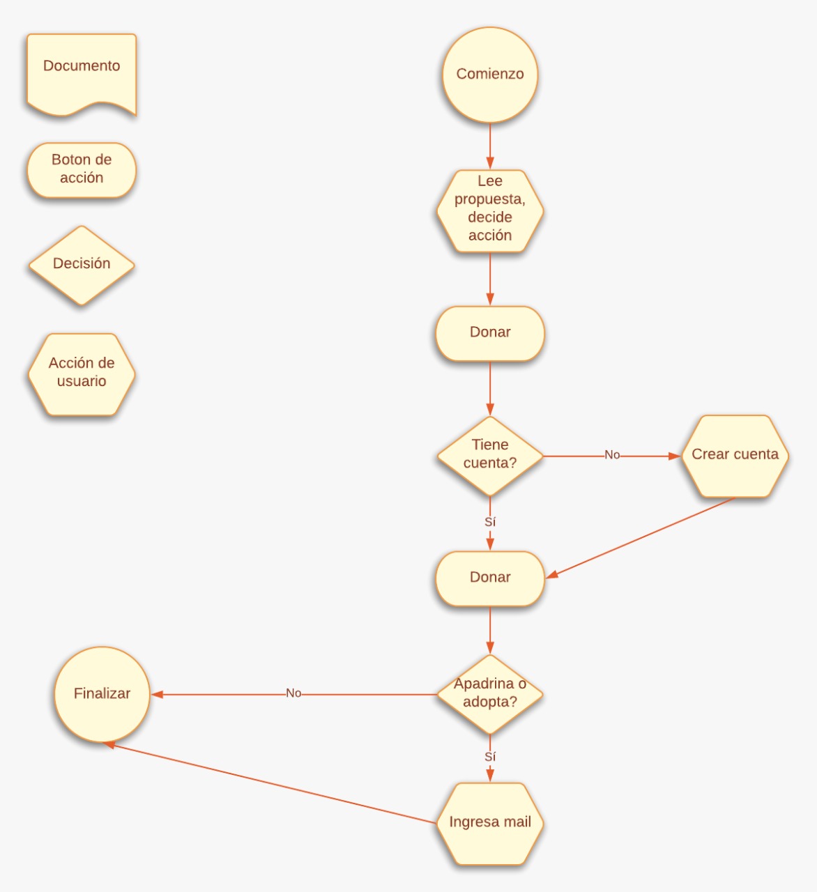
A partir del diagrama de flujo mostrado más abajo, desarrollé las distintas pantallas de la app. Utilicé un lenguaje regionalista porque entre las diferentes opciones está la de adoptar, así que lo imaginé más local. Sin
embargo, es totalmente adaptable a un tono más neutro.
En la primera pantalla, se explica de qué se trata la app en una forma clara. Elegí el botón con el texto
"Otro Día" porque la opción de "No quiero donar" me parecía que podía generar un rechazo en el usuario.
El login previo a la donación es sencillo, con las opciones de login con una cuenta previamente registrada o crear una nueva.
Con un segundo agradecimiento, se invita a donar, pero también se da la opción de "Quiero Saber Más". Se explica que la donación es por única vez pero que hay distintos programas, tanto de padrinazgo como
adopción, por si se quieren involucrar más. Usé la primera persona en ese CTA, para empatizar con el usuario, poniéndome en su lugar.
Se muestra algunos de los rescatados del refugio y se invita a dejar el email, por donde será contactado por la organización.
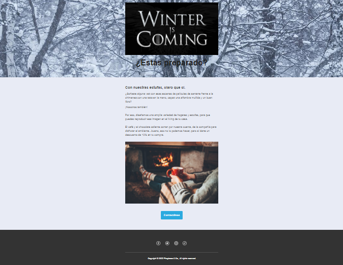
Fireplace & Co.
UX Writing | Email | Storytelling | Copywriting
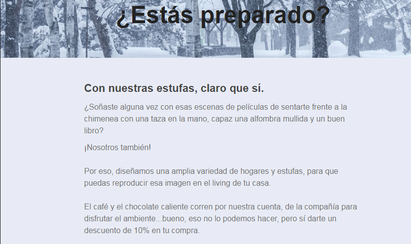
Diseño de email donde se invita al usuario a comprar un producto ofreciéndole un descuento.
Se crean imagenes visuales que llevan a un lugar agradable, mediante imágenes sensoriales a través de la escritura, apoyándose en distintas fotografías de archivo.
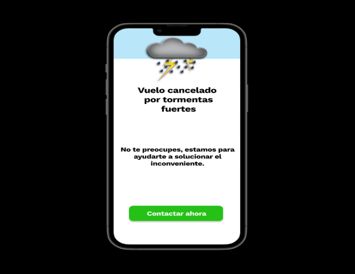
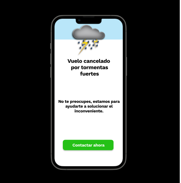
Un viajero se encuentra en el aeropuerto esperando el último tramo de su viaje, cuando se cancela su vuelo debido al mal tiempo.
Desafío
Notificar desde la aplicación de la línea aérea acerca de la cancelación de vuelo y lo que debe hacer el usuario.
Requisitos
Título: 45 caracteres máximo.
Cuerpo del texto: 175 caracteres máximo.
Botón: 25 caracteres máximo.
Mi solución
"Vuelo cancelado por tormentas fuertes". Decidí que el título debía ser en tono informativo sin ser alarmista, describiendo el problema. Al leerlo, el usuario entiende lo que pasa, siendo el lenguaje claro
y conciso. Total de caracteres usados: 37
"No te preocupes, estamos para ayudarte a solucionar el inconveniente". En el cuerpo del programa se le da seguridad al usuario de que la compañía va a estar presente, ayudándolo. Se usa la palabra
"inconveniente" en lugar de "problema", para reforzar que es algo que se puede solucionar con la compañía, haciendo el mensaje tranquilizador. Total de caracteres: 68
"Contactar ahora".Uso del infinitivo para que el usuario entienda que tiene el poder de acción. Explica en forma clara lo que debe hacer: comunicarse con la compañía donde se le dará una solución. El
uso del "ahora" refuerza la tranquilidad de que su problema será solucionado en el momento por la línea aérea. Cantidad de caracteres: 15
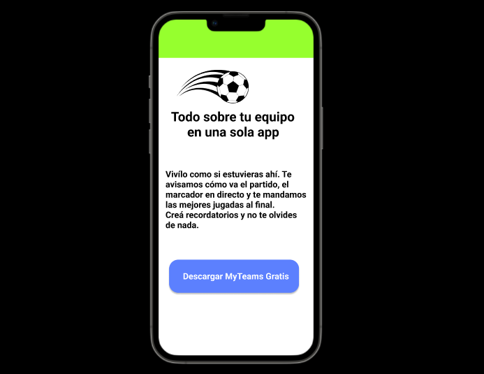
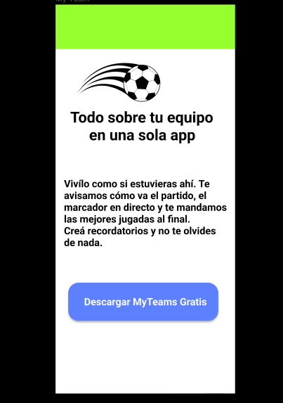
Publicidad informativa de una nueva App, dirigida a usuarios fanáticos del fútbol que no pueden ver los partidos por motivos laborales.Necesitan un producto para seguir a su equipo.
Desafío
Escribir una pantalla promocional de una nueva app que realiza seguimientos de distintos equipos. Crea recordatorio de partidos, notifica el marcador en tiempo real y puede enviar videos con las mejores jugadas.
Requisitos
Título: 40 caracteres máximo.
Cuerpo del texto: 175 caracteres máximo.
Botón: 25 caracteres máximo.
Mi solución
"Todo sobre tu equipo en una sola app". Se llama la atención del usuario, informándole que tiene todo lo que necesita en un solo lugar, sin tener que recurrir a distintas fuentes. Cantidad de caracteres:
36
En el cuerpo del mensaje se trata de empatizar con el usuario "Vivílo como si estuvieras ahí", sabiendo previamente que va dedicado a fanáticos del fútbol que no pueden asistir. En el resto del cuerpo,
se enumera lo que puede hacer con la app. Total de caracteres: 173
En el CTA, usé el infinitivo, para centrar la decisión del usuario. También introduje el nombre de la app por si desea descargarla en otro momento y capitalicé Gratis para que el usuario sepa sin lugar
a dudas, que no tendrá ningún cargo por la misma. Al ver el nombre de la app y la palabra "gratis", genera confianza en el usuario. Total de caracteres: 23
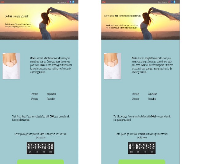
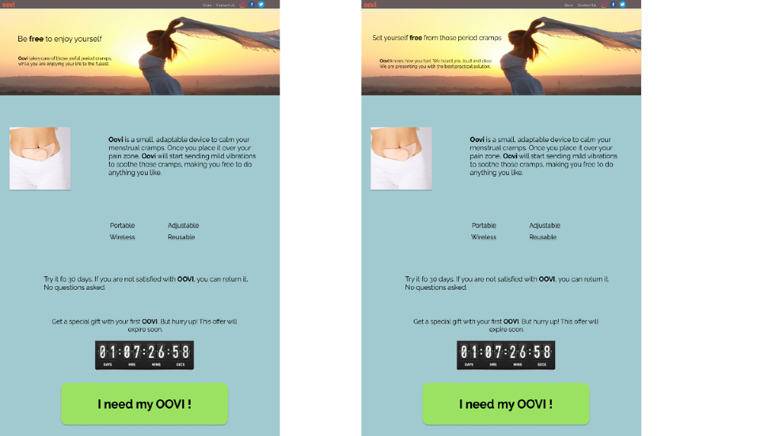
OOVI
Redising through AIDA formula.
OOVI Case Study
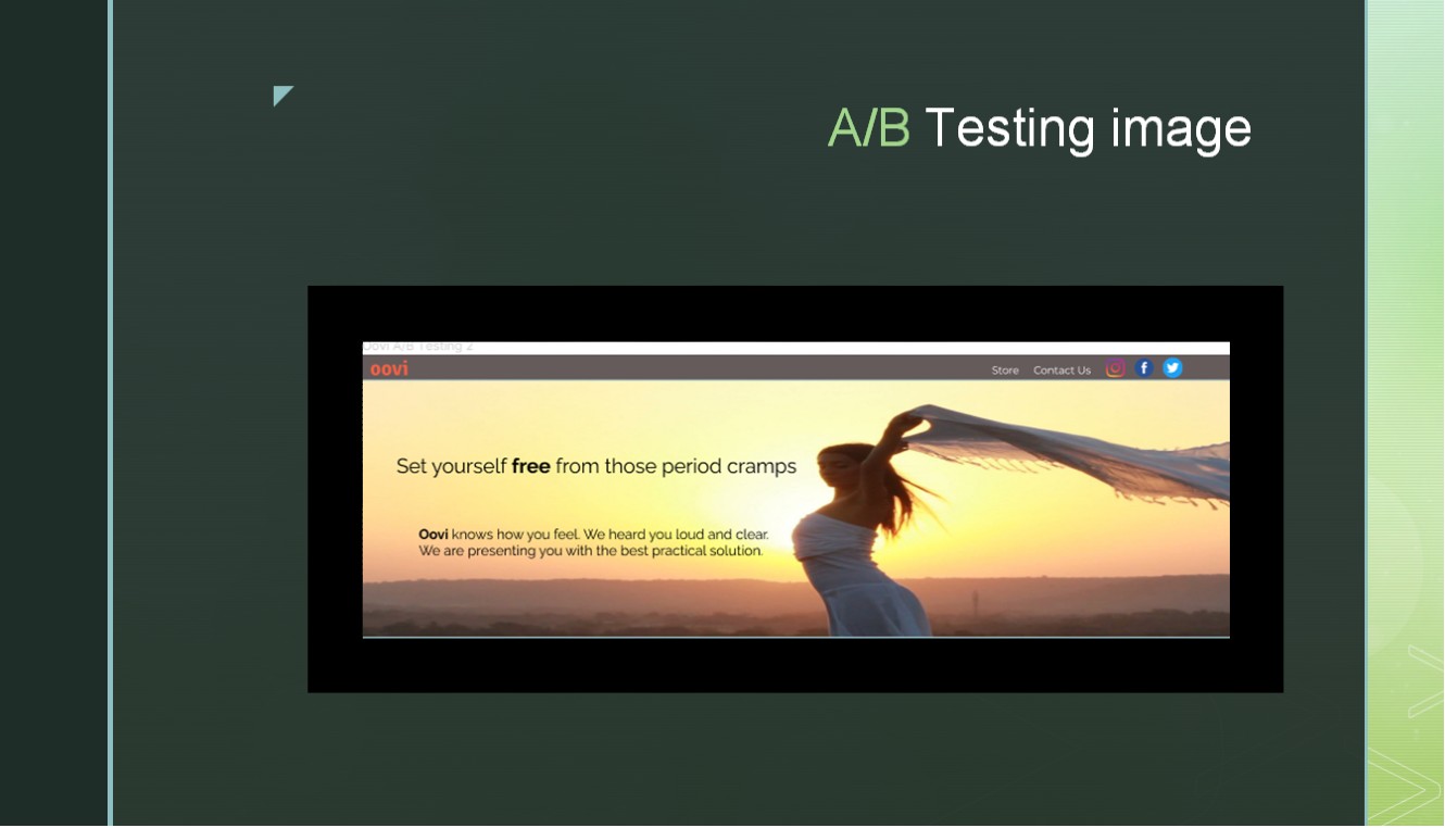
OOVI is a product from the UK to sell a gadget to relieve period cramps. Their website is pretty cluttered, so I thought of a better solution using the AIDA formula (Attention Grabber, Interest, Desire, Action). For testing
purposes, the Attention Grabber part has an A|B testing. Original design can be found at OOVI.
Text 1: Be free to enjoy yourself. Oovi takes care of those awful period cramps, while you are enjoying your life to the fullest.
Text 2: Set yourself free from those period cramps. Oovi knows how you feel. We heard you loud and clear. We are presenting you with the best practical solution.
Conclusion:
My choice would be the second screen. It empathizes better and goes right to the point with the targetted audience's pain point (no pun intended).
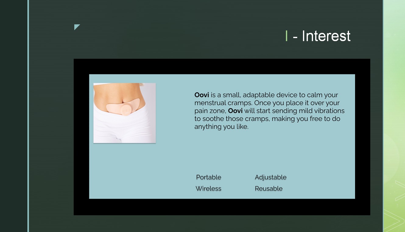
Interest
For the I part of the formula, I decided to explain how OOVI works and highlight some of the best features it has.
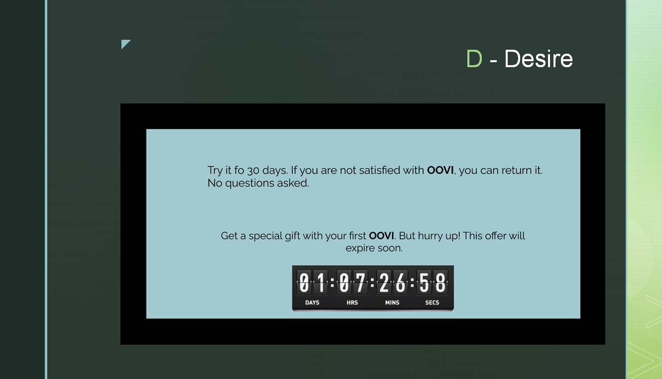
Desire and Action
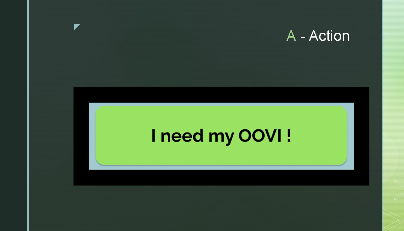
For the D and A part, I used the formula of “satisfaction or money back”. Also, tipped for a “Special Gift” if you act now, adding a countdown clock so the client has the urge to act. How does a client act? Just click on
the I WANT MY OOVI NOW !. Yes, I used all capital letters and an exclamation mark because I wanted to show the urge of getting OOVI before this offer ends.
.jpg)